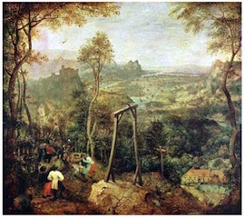
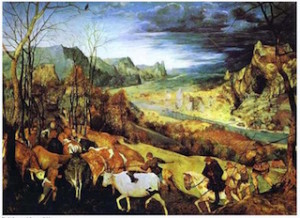
An artist’s compositions tend to employ characteristic devices. For example, these two Bruegels use the foreground oblique (the triangular shape beginning at one corner), block it with a tree at the edge of the canvas, and then zigzag into the distance.
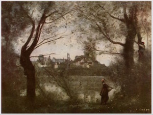
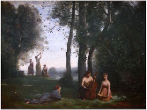
Corot uses a foreground screen of trees and then a subordinate distance visible beyond.
And so on. How striking, then, is the wonderfully varied work of Utagawa Hiroshige (1797-1858). No doubt his variety of means was driven in part by the fact that he did a lot of sets–the examples here are from “One Hundred Famous Views of Edo”–and it would have been pretty boring to have one after another done the same way. But whatever his motivation it’s impressive to see how boldly inventive, to say nothing of masterful, his views could be.
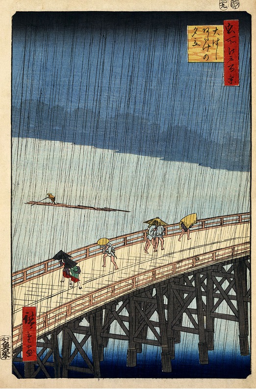
Here Hiroshige uses the foreground oblique, like Bruegel. The far shore zags back, and then the whole composition is boxed in with the dark blue above and below so that the eye stays in the bright and lively middle.
An advantage Hiroshige has, for which European artists have no traditional equivalent, is the use of the red text blocks, which draw the eye across the central space as well as picking up the robes of two pedestrians, and the square one, which is rhymed by hat, umbrella, and whatever-it-is to the right.
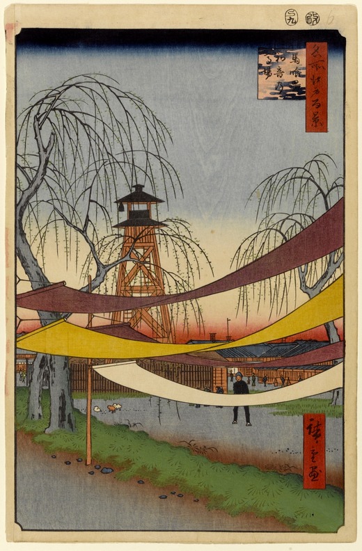
Above, this would be a pretty humdrum village view with the foreground oblique, except that the view is interrupted by the swoops of drying material that Hiroshige hangs from the left edge as if it were a pole, and then drives right off the right side in an unapologetically abstract stroke. The color of the square text block matches the lower part of the sky. Again, the dark blue at the top.
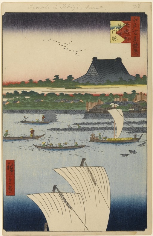
Here, a pretty severe landscape of horizontal bands, enlivened by those wonderful sail shapes. The darkening blue keeps the front pair from falling out of the bottom of the composition.
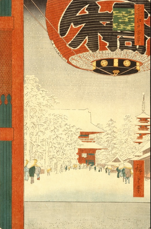
And finally, this improbably asymmetrical extravaganza of orange, green, and delicate off-white fading to black at the top, picking up the black in the lantern and fixing it, as the sails above were fixed by the water. Notice the trees–how delicately and suggestively they are drawn, rhyming the rooflines of the buildings. That little bit of dark gray sky holds the lantern in place, and keeps it from floating away.
How novel and unexpected is the whole design. You have to admit that Hiroshige really knew what he was doing.
One Hundred Views of Edo #58, #6, #78, and #99. All images from Wikipedia, which shows the whole series.