LEARNING FROM NOT SO GOOD
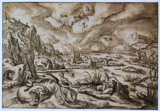
We grow so accustomed to seeing really good art that it’s easy to miss what makes it good–hence the comparison here between treatments by Hans Bol (1534-1593) and Rodolphe Bresdin (1822-1885) of figures in rather similar big landscapes.
The vital difference here is coherence. Nothing in Bol’s piece quite relates to anything else. It’s a jumble of elements in search of an overall narrative. The foreground group, four figures and a fish, is drawn as if each were a separate little study that has been cut out with scissors and pasted down wherever there is room. The whole group on its little island has the same lack of relation to the rest of the composition as the pieces do to each other. It kisses the farther shore in a few places, enough to muddle, for example, the woman’s outline, without really connecting foreground and distance. Follow the shoreline as it drifts aimlessly, rising and falling. Middle tones baffle Bol. Shapes are left left white unless there is some immediate descriptive necessity. Objects are seen one by one, rather than as contributory pieces of a whole with a whole meaning. Poor Phaethon and his horses are lost in the muddle of shapeless clouds.
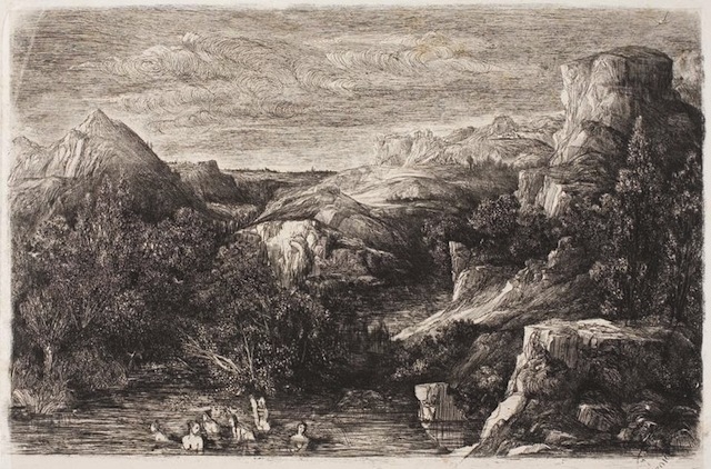
Bresdin’s landscape, on the other hand, while quite similar in design, is seen from large to small. The mountain shapes to left and right form a V, joining with the foreground copse of trees. The trees gather into strong darks above the water–so dark that the eye jumps to the whites of the bathers. Contrasted with the middle tone of the pond they are drawn very simply (compare with Bol’s muddled lady).
From the V the hills fold back, first in a long recession on the right, then a more distant formation on the left, and finally to the far horizon. The richly worked sky–several swoopy horizontal bands–links the mountains to right and left, and by its weight keeps the eye from floating away from the foreground.
Within this grand design there are many unifying themes. Look for bright white shapes. Look for textures. Again and again they are varied and repeated. The horizontal shading of the water reflects the sky. The light, meanwhile, comes consistently from the left.
In a word, Bresdin’s is a wonderfully intricate but in no way mechanical composition. Compare with Bol. You will, in fact, find resemblances, but the results are very different.