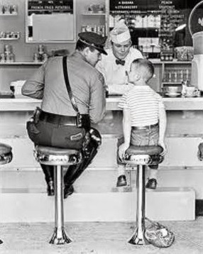
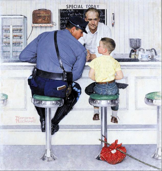
Action painting and Pop were hot when I was in art school in the ’60s. Narration was out, and you had only to mention the name of Norman Rockwell to invoke all that was sentimental and retrograde. But construction of effective images has been central to art since the Egyptians, and if we discount where he was going, he really knew how to get there. As we can see by comparing his painting “Runaway” with its source photo. The one obviously follows from the other, but the alterations are many and telling.
The biggie is the simplification of the space to close white tones so that cop and boy stand out dramatically. The rectangle of the blackboard unites cop and clerk. The molding on the front of the counter has the same effect between cop and boy. The clerk in the photo is young and confident, an equal third party in the scene; Rockwell makes him older, balding, wistful: his dreams are over, but the boy has it all before him. Rockwell also places him higher and slightly behind the cop so that he doesn’t interfere with the main action. Even his complexion is paler, so that the warm-toned cop dominates, followed by the pinkish boy.

Rockwell’s cop is broader in the shoulders to make him more imposing; he leans closer to the boy, his head is tipped forward a little more. The boy is turned a little away, his hands in his lap, his right foot turned out. The effect is to make him shyer, less assured. His head is clearer against the white of the wall, and notice how Rockwell has put a towel over the clerk’s shoulder to make the boy’s face clearer.
The boy’s bag is bigger, bright red, and equipped with the runaway’s traditional shoulder stick. The footstep, which in the photo ends in a dark shadow, runs straight across in the painting. Floor and step and counter and molding–all the same, slightly darker blue–form a pattern of long, swift horizontal lines that unite the parties and set off the verticals of the stools and the paneling of the back wall.
Also interesting is how Rockwell left things alone if they worked already: the reflections in the stools; the positions of the cop’s feet; his ticket book; the the stripe on his pants; the highlights on his leather.
In a word, sentimental, but a knowing act of story telling.
And while we’re on the subject, it’s a mistake to dismiss Rockwell as invariably sentimental. Some of his pieces, like “The Problem We All Live With” (1964) are nothing if not edgy and clear-eyed.

