!["Sculpture and Vase of Ivy" 1916 [Tikaoja Art Museum]](http://www.stanwashburn.com/wp-content/uploads/2013/03/Matisse-sculpture-vase-of-ivy-1916-Tikaoja-Art-Mus.jpg)
One of the unexpected delights of the recent Matisse show at the Met was “Sculpture and Vase of Ivy.” I’d never seen it before.
The surfaces and layers of paint are fascinating in the Matisse-y way, which is only partially evident in reproduction (hasten to the Tikanoja Museum in Vaasa, Finland to see it in the flesh). There is a lot of pink underpainting that gets covered over more or less in blue, but peeks through in a lively way. Having decided on the blue, Matisse doesn’t lay in a smooth, consistent layer, but piles it on and leaves it rough.
Easier to discuss here is the relation between the painting and the sculpture it is based on (below). He isn’t just copying. The painting simplifies but also varies every detail. The thigh is far larger and more prominent; the rest of the figure is flattened and greatly simplified (her left arm, her head, the shape of her torso) and darker in tone. Oddly, her right arm, which in the sculpture is jammed back, has an altogether more natural and comfortable shape in the painting.
!["L'Aurore" 1907 [pikasso02.skyrock.com]](http://www.stanwashburn.com/wp-content/uploads/2013/03/Matisse-LAurore-1907-pikasso02.skyrock.com_.jpg)
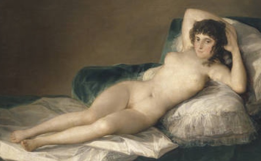
Matisse’s freedom in matters of detail, proportion, and everything else is especially clear if we compare his pieces with, for example, Goya’s more conventional approach in these matters.
Returning to the painting, there is the odd matter of the two vertical stripes on the left. They aren’t descriptive (of a doorway or window, for example); they’re just stripes. They repeat the bright tones of the thigh and the rim of the vase, which would otherwise be overwhelmed by the darkness and intensity of the blue surround; they brighten the whole; but those are matters Matisse could have addressed directly by tonal adjustments. What they really accomplish is to emphasize the abstract, decorative nature of the piece. They rescue it from being simply a “view” of a still-life.