Robert and Jane Meyerhoff must have been either very peppy connoisseurs, or very well advised, or both, judging from the show of their collection at the deYoung Museum in San Francisco ( until October 12).*
!["Third Station of the Cross" 1960 [wikiart.org]](http://www.stanwashburn.com/wp-content/uploads/2014/06/Newman-Third-Station-of-the-Cross-60-wikiart.org_.jpg)
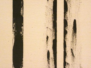
So far, so good. But “Stations of the Cross?” Here we get into the talk part. Newman says that the series refers to Christ’s words, “Why did you forsake me?” — “. . . the question that has no answer.”
Okay, that’s interesting as a beginning point for him, as a part of his train of thought. Artists have these internal monologues. And yet I doubt that many viewers, contemplating this series, would be put in mind of Biblical themes if they weren’t prompted. I have to think that this is simply Newman’s ploy to impart spiritual grandeur to an abstract formal exercise. It projects insecurity. It’s as if he were standing behind me in the room, tapping me on the shoulder to inform me, in case I’m not sensitive enough to figure it out on my own, that this is Big Stuff.
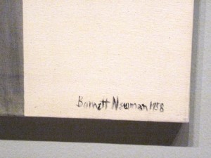
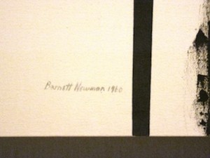
And then there is his signature. You’d think that on canvasses so grandly conceptual, so provocatively minimal, so baldly calculated in their nuances and lacunae, that a name, a bit of cursive, would be an intrusion, an alien presence. Nevertheless, there is a personal, squggly signature written small but earnestly somewhere along the bottom edge of each canvas. In the context they seem oddly cuddly and domestic. Possessive and insecure. Go figure.
*Well, mostly well advised–any collection that includes David Salle or Eric Fischl has clearly gone off the tracks at least temporarily. We’ll come back to that next week, along with other, serious delights.
** See similar devices in Rothko: archive, 11/30/12.