Old-fashioned (call it “pre-war”) art was often inventive and visually complex. The Edward Hopper piece here is full of odd colors and shapes. Its rhymes and repetitions–the bread and butter of composition–are subtle. But it works, it holds together, and the only real diss that a committed modernist could lay on it is that it’s a “picture:” a representation of a real space. Worse, as “pictures” often do, it tells a story: cute, bored usher lost in her own thoughts.
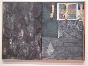
“New York Movie” 1939 [moma ny] A great deal of post-war modernism has devoted itself to escaping the story-telling conventions of pictorial representation. Flatly abstract art often succeeds, although it’s hard to find abstract work that’s actually more robustly abstract than this Hopper–and so far as that goes, much abstract art projects such a strong emotional charge that we respond to it in almost a narrative way. Check out Barnett Newman’s “Stations of the Cross” in last week’s post. Newman doesn’t use a cute gal, but he still employs a story to grab his viewers and coax them into reinforcing his devices with a web of their own associations. Then there are intermediate examples. The Meyerhoff collection now showing at the deYoung Museum in San Francisco includes several interesting examples, such as the Jasper Johns below.
“Perilous Night” 1982
In effect, the Johns is quite like the Hopper. The abstract shapes and areas combined with stuck-on arms create a similar sort of visual disjunction. But the title is evasive where Hopper is frontal. “New York Movie” doesn’t waste your time: you’re looking at what you think you’re looking at. “Perilous Night,” on the other hand, fends off the idea of the narrative image by implying a maelstrom of some sort without tying the viewer down to any particular story. You’re intrigued? Interpret the pieces as you like. Let your imagination rip. The Hopper is rich and complex but there’s only one way to read it. Johns requires you to be a co-participant if you find his elements interesting enough to make the effort.
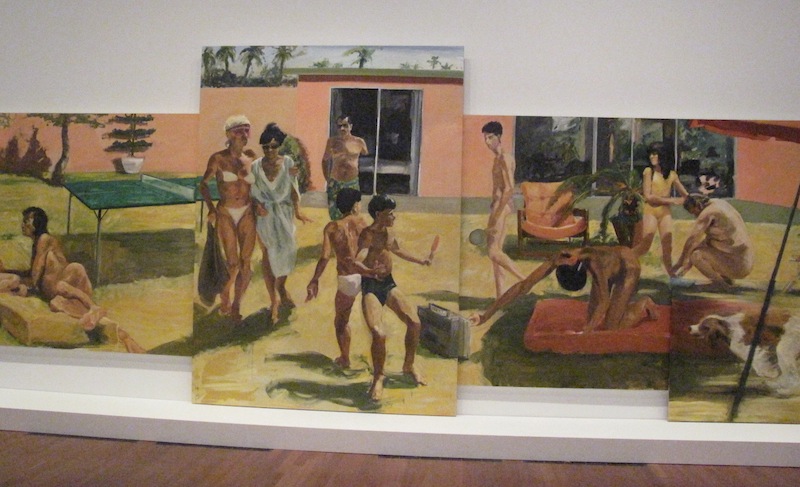
The Johns marks a significant demarkation line between abstraction and representation. Get much more abstract than that, and you are going the whole hog. Nothing wrong with that except that there are only so many ways of pushing paint around without the intrusion of some sort of recognisable image. A painter who lets image happen is in peril of falling into retro narrative. One way to avoid that is to push Johns in the opposite direction: have images–“pictures,” if you like–but render them unintelligible as a story. This way you have your cake and eat it too, with straightforward images garbled so that pictorial literalism is exploited and transcended in one fell swoop. This Eric Fischl, for example (still with the Meyerhoffs, here). Lots of life-size figures that look as if they belong in the same picture, but don’t seem to be; a plodding illustrative style that is saved from prettiness by its washy paint handling, incoherent composition, and execution on four canvases of various sizes and shapes cobbled together for oddness
“Saigon, Minnesota” 1985
rather than any expressive purpose. Surely, the viewer is invited to think–surely with all this–well, whatever–there must be some meta-narrative. Not a “picture”–something grander.
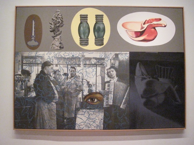
“Coming and Going” 1987
David Salle pushes the same approach another step along. This piece throws in several perfunctorily unrelated images including his trademark naughty bit to make it clear that he’s going for something serious and sophisticated.
Paradoxically, the result for both Fischl and Salle are “pictures” in the most literal sense: pictures of fashion art.
!["New York Movie" 1939 [moma ny]](http://www.stanwashburn.com/wp-content/uploads/2014/06/Hopper-New-York-Movie-1939-moma-ny-300x238.jpg)