Picking up on my comment last week about Vuillard’s soupy tabletop: in that piece, soupy is a defect because it confuses that shape, and also because it’s inconsistent with the handling of the paint elsewhere, which is either pretty lean or pretty rich and lumpy. But there are ways and ways to handle surfaces. Here we look at four of them.
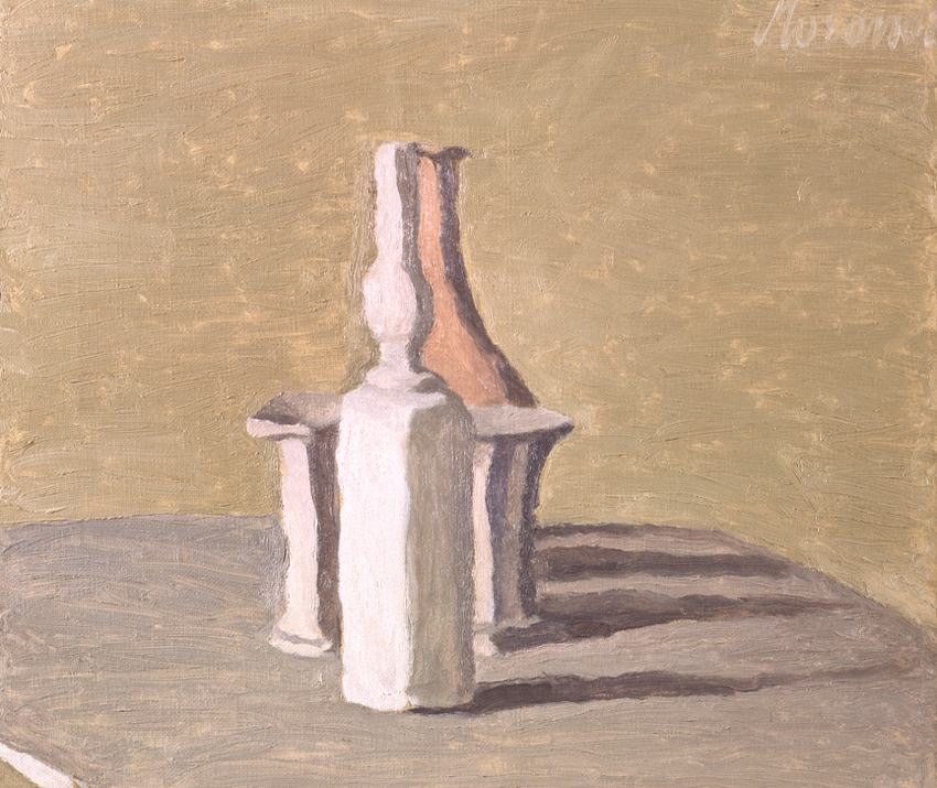
Soupy isn’t necessarily a fault. Giorgio Morandi, for one, made very effective use of this handling in his still lifes. In the example here, the surface colors are mopped on over a slightly lighter, beige ground tone. The wet brushyness of the surface works with the wiggly drawing of the shapes: objects not quite symmetrical, verticals not quite vertical, straight lines not quite straight, the tabletop oddly pressed down in the middle, like a pillow. Morandi teases the eye: you know it isn’t right, but it’s fascinating anyway. And in that light but thoughtful mode, the whole composition has a light, spacious quality. To pull that off without his large shapes getting boring, Morandi rewards you with subtle but engaging textures wherever you may wander.
!["Still-Life" 1890 [National Gallery of Art, DC]](http://www.stanwashburn.com/wp-content/uploads/2014/07/Peto-1890-National-Gallery-of-Art.jpg)
This piece by John Frederick Peto approaches the surface interest problem from the other direction. His surface is tight and dry, minutely describing the textures of each object but seldom laying down a recognizable brushstroke just for the hell of it, for its own sake. To make these restrained textures work while keeping the eye alive he needs more action than Morandi does–more shapes, folds, contrasts. No surface goes far without being interrupted or modulated.
!["Basket of Wild Strawberries" 1761 [W'Commons]](http://www.stanwashburn.com/wp-content/uploads/2014/07/Chardin-Basket-of-Wild-Strawberries-1761-Wikimedia-Commons.jpg)
Jean-Baptiste-Simeon Chardin solves these problems by drawing more freely than Peto, but keeping his surfaces descriptive, however brushy. Objects are loosely handled, but obviously describes objects. This lets him get spacious and suggestive, like Morandi, in a way that Peto can’t.
!["Knife and Glass" 1963 [Wikiart.org]](http://www.stanwashburn.com/wp-content/uploads/2014/07/Diebenkorn-knife-and-glass-63-wikiart.org_.jpg)
And then Richard Diebenkorn, who does everything. He does the Morandi-esque soupy surface over a contrasty blue undertone, which keeps his large areas hopping. He zooms in, which divides his background into sharp, separate shapes–rather like Peto. He draws freely but descriptively, like Chardin.
And so, back to Morandi.