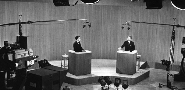
I think of the ’50s and ’60s as a visually as well as socially discordant period—the Gray Flannel Suit on the one hand, and hippie tie-dye on the other. But some things made sense. Perhaps it was only that television was still in its comparative infancy, but the Kennedy-Nixon debates, for example, were presented as a spirited discussion of issues without distractions. The visuals were dull as ditchwater, but the point was to offer a clear look at the candidates, not to torque up the viewers with spectacle.
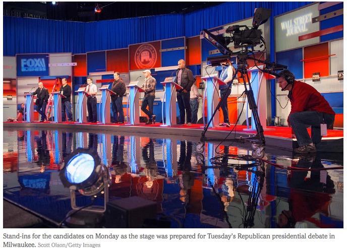
As opposed to the set for the most recent Republican debate, below—rampant visual clamor.
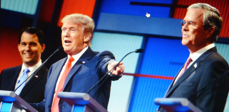
Of course you might defend the set as quite in keeping with the antics of the candidates, but perhaps we won’t go there.
But while the shapes and colors were gross and distracting, one must admit that the lighting was held in enough that the candidates’ faces stood out against the background. As compared with the most recent Democratic debate . . .
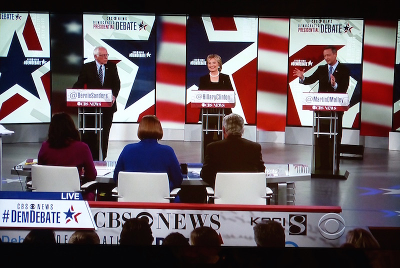
. . . which went from bad to worse. It was as if the set designers had instructions to demonstrate that Fox has nothing to teach CBS about vulgarity, and to ensure that nothing a candidate could do or say would distract attention from the venue. In the long shots, as below, it took a moment even to find the bodies amidst all the shrieking visual clutter. Closeups were even worse, with constantly changing, bright white, face-size labels popping up right beside the faces of the speakers, and shadowy shapes slowly drifting across the stars and bars.
At least there wasn’t a soundtrack under the voices–ardent, pulsing undertones to accentuate the drama of the thing, in case arguments over Wall Street machinations and Paris attacks couldn’t sustain viewer interest on their own.
No doubt that comes next.


