COPYING THE MONA LISA, SORT OF
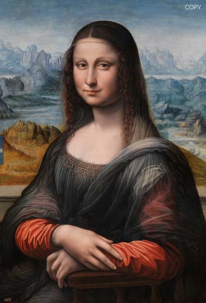
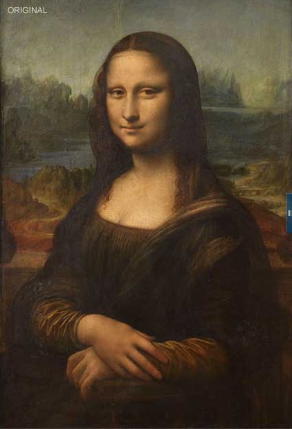
And speaking of revisions to paintings, as in the Lady with a Unicorn last week, an interesting article by Suzanne Daley in the New York Times of April 13, 2012 (http://www.nytimes.com/interactive/2012/04/14/world/europe/Not-Just-Another-Fake-Mona-Lisa.html ) demonstrates that the cleaned and restored copy of Leonardo da Vinci’s Mona Lisa from the Prado, shown here, reveals the same pattern of alterations as the original, and therefore must have been done at the same time, in close collaboration.
So: if the Mona Lisa is obviously old and much varnished and dirtied, as such old paintings often are, and if the restored copy looks as it does, might the original resemble the copy if it were given the same treatment?
Maybe, but maybe not, and in essence definitely not. It certainly seems that the copy is based on Leonardo’s original, and done at the same time, but there are many obvious and substantial differences. If the copyist was working alongside the master, he was nevertheless doing his own thing.


Begin with the landscape. Leonardo’s comprises three distinct bands, warm in the foreground, cooler in the distance, that pass across the picture from side to side. They are nicely varied so they don’t seem mechanical, but they support the figure.
The copy’s landscape is remarkably different than the original, and weaker. This is partly the washy blue color, but beyond that, the design competes with the figure rather than supporting it. Look at the road, a taut serpentine in the original, coiling around a substantial promontory; it is almost unnoticeable in the copy, and the promontory is reduced to a minor ridge. Across the road Leonardo places a substantial mass that rises toward the figure, passes behind her, and appears again on her left. The effect is to guide the eye into the figure and eventually into the landscape beyond. The farther mountains beyond the water on her right drop down to her eye level and then reappear as a flat mass on her left, again holding background and foreground together. The farthest mass repeats the device a third time.


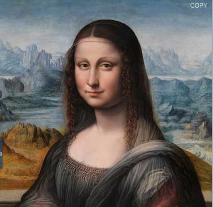
In the copy, the near landscape is divided by the figure into two parts with no relation to each other. The little triangle on her left doesn’t describe anything, and slips confusingly into her costume. The distant landscape is watery and arbitrary. The mountains on the left are full of fidgety detail that draw the eye away from the face. The continuation on her left side is not a simple mass, but an arbitrary cluster of bosom shapes. These are not imbalances that might have been caused by overcleaning; the painter was chasing details one by one, without regard to their cumulative effect on the whole.
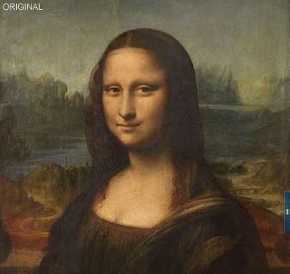
This indiscipline carries into the figure herself. The face in the original is firmly drawn. It tilts a little to the right so that the right eye is slightly lower than the left. The copy tilts the other way: compare the angle of the noses. The copy’s eyes are level, closer together, and fluttery. Compare the shape of the chins: the one, firm and pointed; the copy, softer, rounder, more jowly. The famous Gioconda Smile is reduced to a wistful smirk. The right sleeves: Leonardo’s makes a positive, outward-pressing descent that draws the eye out and down. It offers a dramatic right angle to the road, and almost loses itself in the shadows of the mountains. That same form in the copy is a negative, like the original with the air let out, and by its slackness, and the harsh contrast with the landscape beyond, contributes to the separation of foreground and background.
And so on. These are details, but details are where the art happens. They account for why the original is so solid and imposing while the copy is so washy and meandering.
Surely if Leonardo were training the copyist, or had some direct interest in the result, he would have corrected all this. So the copyist was some conventionally trained person of pedestrian talent with access to the master’s studio, eager to pick up tricks, but ill-advisedly playful, and beyond critique. Some wealthy dilettante? The mystery continues.
The illustrations are from the Times article. The blue tabs are from the interactive feature that lets you glide from one to the other.
This post is a reprise of April 21, 2011.