Rothko’s touch
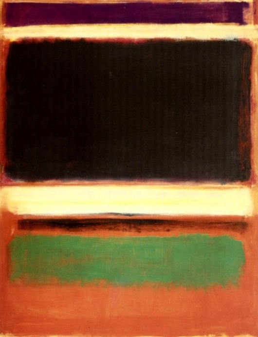
Mark Rothko (1903 – 1970) is noted for his rich and moody color fields, but color is only part of what makes them so effective. It’s his touch that keeps the eye engaged. He didn’t just mark off rectangles and hog them in; they are veils, sometimes heavy, sometimes light, so that one never quite loses the under layers and the effect of the several colors. More, his edges are never simple or predictable. Pick an edge–any edge–and follow it. Sometimes it will be firm, sometimes hazy; sometimes straight, sometimes meandering. In the presence of an actual Rothko you can put your eye close to an edge and follow it, and you will never be able to predict, from what is happening in front of you, what will happen six inches on. Everything–shapes and their edges and the spaces between–are exploring and testing all the time–which is what a viewer must do to really see and experience a Rothko.
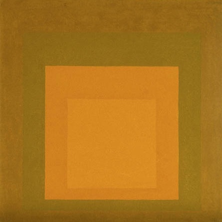
By comparison with which, the vaguely similar researches of Josef Albers (1888-1976) leave me admiring in theory, but unengaged. He did hundreds of them. They remind me of reading the dictionary: informative, but not life-enhancing: too much attention to theory, and not enough to the excitement of discovery.
